Table of contents
Creating UIs
Vaadin-on-Kotlin uses the Vaadin Platform to deliver the UI. Vaadin lets you forget the web and develop user interfaces much like you would build a desktop application with conventional Java toolkits such as Swing or SWT. You add components such as Button and TextField into the page, nesting them in layouts which then position the components.
Introduction
A Vaadin component has two halves:
- A client-side Web Component, typically built with Lit. It owns the rendering — Vaadin does not generate HTML for you.
- A server-side Java/Kotlin class that mirrors the web component’s API and is what you actually program against. Vaadin Flow keeps the two sides in sync over a WebSocket / HTTP channel: it forwards property changes, attribute updates, and events between them.
The upshot is that adding e.g. Google Maps to a view looks like this:
class MyView : VerticalLayout() {
    init {
        setSizeFull()
        val maps = GoogleMaps()
        maps.setSizeFull()
        add(maps)
    }
}
You never write <google-maps> HTML; the component’s client-side bundle handles rendering and the server-side GoogleMaps class is what you talk to.
Components are typically rich in functionality — for example ComboBox does not render to a plain HTML <input> but to a <vaadin-combo-box> tree that supports filtering, async loading, and custom item renderers. The rendering is owned by the component’s client-side code and generally isn’t controlled directly from server-side Kotlin.
A typical Vaadin form uses FormLayout with TextField, Checkbox, DatePicker, etc. nested inside it. In plain Java that looks like this:
FormLayout layout = new FormLayout();
TextField nameField = new TextField("Name:");
nameField.setValue("Donald Knuth");
layout.add(nameField);
layout.add(new Checkbox("Internal employee"));
layout.add(new DatePicker("Date of birth:"));
With VoK we build the same hierarchy using a Kotlin DSL — see DSLs Explained for the language-level details. The next sections walk through it.
The following text doesn’t expect you to be familiar with Vaadin, but a basic grasp of Kotlin is helpful — if anything in the snippets looks unfamiliar, take a detour through the Kotlin docs first.
Available components
Vaadin ships a large palette of pre-made components — browse them in the Vaadin Components documentation. For everything else, the Vaadin Directory hosts community add-ons; filter by Vaadin 24+ to make sure the add-on is compatible with current Flow.
You can also integrate a standalone web component. Pick a Lit-based component (or any framework-less custom element), declare it as an npm dependency on your view, and follow Vaadin’s Integrating a web component guide.
Creating views
Clone the VoK Hello World App — we’re going to experiment on it. Open WelcomeView.kt: the class extends VerticalLayout, which makes the root layout of the view vertical.
Vaadin doesn’t ship its own layout manager — it delegates to the browser’s CSS engine (flexbox and grid). VoK still exposes
VerticalLayoutandHorizontalLayoutas flexbox wrappers for familiarity. Their behavior is closer to flexbox than to Vaadin 8’s old layouts; for a deep dive see VerticalLayout and HorizontalLayout.
Let’s replace WelcomeView’s contents with a single button:
package com.example.vok

import com.github.mvysny.karibudsl.v10.*
import com.vaadin.flow.component.notification.Notification
import com.vaadin.flow.component.orderedlayout.VerticalLayout
import com.vaadin.flow.router.Route

@Route("")
class WelcomeView : VerticalLayout() {
    init {
        button("Click me") {
            onClick {
                Notification.show("Clicked")
            }
        }
    }
}
The button() function creates a Button, sets the caption, attaches it to the parent layout (here the root VerticalLayout — i.e. WelcomeView itself), and runs the configuration block. The block wires up a click listener. Ctrl-click the function name to see its definition; it’s a two-line extension:
public fun (@VaadinDsl HasComponents).button(
    text: String? = null,
    block: (@VaadinDsl Button).() -> Unit = {},
): Button = init(Button(text), block)
This is a Kotlin DSL builder — receiver extensions plus a trailing lambda. If the shape doesn’t click yet, that’s fine; read DSLs Explained for the full story. For now: the function creates a button, adds it to the parent, and lets you configure it further.
Info: VoK builds UI as a hierarchy using a DSL (domain-specific language). Since a UI is a tree of components nested inside layouts, this maps naturally. See Using DSL to write structured UI code for the rationale.
Now let’s add a small form with two text fields:
package com.example.vok

import com.github.mvysny.karibudsl.v10.*
import com.vaadin.flow.component.notification.Notification
import com.vaadin.flow.component.orderedlayout.VerticalLayout
import com.vaadin.flow.router.Route

@Route("")
class WelcomeView : VerticalLayout() {
    init {
        formLayout {
            textField("Name:")
            textField("Age:")
        }
        button("Click me") {
            onClick {
                Notification.show("Clicked")
            }
        }
    }
}
formLayout() creates a FormLayout and adds it to the root VerticalLayout, then runs the configuration block with the FormLayout as the receiver. That’s why the nested textField() calls land inside the FormLayout rather than alongside it — Kotlin passes the current layout as the lambda’s receiver. More on that later.
Convention: DSL functions are named in lowerCamelCase after the component they create —
button(),formLayout(),verticalLayout(), and so on. For your own components and add-ons, follow the same pattern (see Creating reusable components below).
Info:
FormLayoutis a responsive layout that re-arranges its columns based on width. See the Vaadin FormLayout docs for the full API.
Layouts
Vaadin delegates all layout work to CSS — there are no JavaScript-based layout managers. Flexbox and CSS grid are powerful enough for everything you need.
To position components, nest them inside a FlexLayout (which renders as <div style="display: flex">) and configure flexbox properties. See A Complete Guide to Flexbox for the CSS side.
The flexbox API is exposed via these properties:
flexLayout.alignContentflexLayout.flexWrapflexLayout.justifyContentModeflexLayout.flexDirection(orflexLayout.style.set("flexDirection", "row-reverse")for unusual values)child.flexGrow(and the karibu-dsl shorthandchild.isExpand)child.flexShrinkchild.flexBasischild.alignSelf
VerticalLayout and HorizontalLayout
If you’re coming from Vaadin 8 or Android, VerticalLayout and HorizontalLayout use a more familiar terminology. They still render flexbox under the hood — they just translate flexbox properties into vertical/horizontal alignment vocabulary.
For background, read the VerticalLayout and HorizontalLayout blog post.
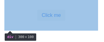
To position children inside a VerticalLayout, use content { align(...) }:
verticalLayout {
    content { align(stretch, top) }
    width = "300px"; height = "100px"

    button("Click me")
}
VerticalLayout uses flex-direction: column to stack children downwards. align(stretch, top) stretches children to the layout’s width and aligns them to the top. The stretch constant in particular makes the button as wide as the parent, even though the button’s own width is undefined. See the karibu-dsl docs for the full align() API.
Examples
Now that you understand the concepts, a couple of examples.
The first is the classical “perfect centering” — trivial with flexbox but a pain with old CSS:
@Route("")
class WelcomeView : VerticalLayout() {
    init {
        flexLayout {
            justifyContentMode = FlexComponent.JustifyContentMode.CENTER
            alignItems = FlexComponent.Alignment.CENTER
            width = "300px"; height = "100px"

            button("Click me")
        }
    }
}
The same effect via VerticalLayout, using the content {} block:
@Route("")
class WelcomeView : VerticalLayout() {
    init {
        verticalLayout {
            content { align(center, middle) }
            width = "300px"; height = "100px"

            button("Click me")
        }
    }
}
A button bar with icons on both edges: a Div in the middle expands to consume the slack and pushes the trailing icon to the right:
@Route("")
class WelcomeView : VerticalLayout() {
    init {
        flexLayout {
            width = "300px"
            icon(VaadinIcon.EDIT)
            icon(VaadinIcon.TRASH)
            div { isExpand = true }
            icon(VaadinIcon.AIRPLANE)
        }
    }
}

Info: browse the Vaadin Icons gallery for available icons, or rely on IDE autocomplete on the
VaadinIconenum.
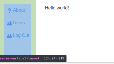
The same approach scales to the application frame. We want the main menu on the left and the content area on the right, taking the remaining space:
import com.github.mvysny.karibudsl.v10.*
import com.vaadin.flow.component.HasElement
import com.vaadin.flow.component.button.ButtonVariant
import com.vaadin.flow.component.icon.Icon
import com.vaadin.flow.component.icon.VaadinIcon
import com.vaadin.flow.component.orderedlayout.HorizontalLayout
import com.vaadin.flow.component.html.Div
import com.vaadin.flow.router.RouterLayout

class RootLayout : HorizontalLayout(), RouterLayout {
    private val viewContainer: Div
    init {
        setSizeFull()
        verticalLayout {
            width = null; height = "100%"; isSpacing = false; isPadding = false
            button("About", icon = Icon(VaadinIcon.QUESTION)) {
                addThemeVariants(ButtonVariant.LUMO_TERTIARY)
            }
            button("Users", icon = Icon(VaadinIcon.USERS)) {
                addThemeVariants(ButtonVariant.LUMO_TERTIARY)
            }
            button("Log Out", icon = Icon(VaadinIcon.SIGN_OUT)) {
                addThemeVariants(ButtonVariant.LUMO_TERTIARY)
            }
        }
        viewContainer = div {
            isExpand = true
        }
    }

    override fun showRouterLayoutContent(content: HasElement) {
        viewContainer.removeAll()
        viewContainer.element.appendChild(content.element)
    }
}

@Route("", layout = RootLayout::class)
class WelcomeView : VerticalLayout() {
    init {
        div {
            text("Hello world!")
        }
    }
}
For more on plugging views into a RouterLayout, see the Navigating guide.
Fields
The other essential family of components handles user input. Each input component is documented on the Vaadin site — for example the TextField docs.
Per-field documentation is out of scope here; useful references:
- The Vaadin Components documentation (overview + per-component pages).
- The Vaadin Directory for community add-ons.
For building forms, populating them, validating, and reading values back, see Creating Forms.
Referencing components
textField() (like every other DSL builder) returns the created component. Capture the reference when you need to read its value later, e.g. from a button click handler:
package com.example.vok

import com.github.mvysny.karibudsl.v10.*
import com.vaadin.flow.component.notification.Notification
import com.vaadin.flow.component.orderedlayout.VerticalLayout
import com.vaadin.flow.component.textfield.TextField
import com.vaadin.flow.router.Route

@Route("")
class WelcomeView : VerticalLayout() {
    private lateinit var nameField: TextField
    private lateinit var ageField: TextField
    init {
        formLayout {
            nameField = textField("Name:")
            ageField = textField("Age:")
        }
        button("Click me") {
            onClick {
                Notification.show("Hello, ${nameField.value} of age ${ageField.value}")
            }
        }
    }
}
Creating reusable components
It’s straightforward to extract a reusable component — just define a class that extends a layout:
class NameAgeForm : FormLayout() {
    private val nameField = textField("Name:")
    private val ageField = textField("Age:")
    val greeting: String get() = "Hello, ${nameField.value} of age ${ageField.value}"
}
To use this class in the DSL fashion, add an integration function:
fun HasComponents.nameAgeForm(block: NameAgeForm.() -> Unit = {}): NameAgeForm =
    init(NameAgeForm(), block)
init() (from karibu-dsl) instantiates the form, adds it to the parent layout, and runs the configuration block on it. The view becomes:
package com.example.vok

import com.github.mvysny.karibudsl.v10.*
import com.vaadin.flow.component.HasComponents
import com.vaadin.flow.component.formlayout.FormLayout
import com.vaadin.flow.component.notification.Notification
import com.vaadin.flow.component.orderedlayout.VerticalLayout
import com.vaadin.flow.router.Route

@Route("")
class WelcomeView : VerticalLayout() {
    init {
        val form = nameAgeForm()
        button("Click me") {
            onClick {
                Notification.show(form.greeting)
            }
        }
    }
}

class NameAgeForm : FormLayout() {
    private val nameField = textField("Name:")
    private val ageField = textField("Age:")
    val greeting: String get() = "Hello, ${nameField.value} of age ${ageField.value}"
}

fun HasComponents.nameAgeForm(block: NameAgeForm.() -> Unit = {}): NameAgeForm =
    init(NameAgeForm(), block)
The KComposite pattern
Instead of extending the layout class directly, prefer extending KComposite:
- The component’s public API isn’t polluted with
VerticalLayout’s methods, leaving a tight, intentional surface.KComposite’s own API is tiny by comparison. - Because
VerticalLayoutno longer leaks through the public API, you can swap the root layout for any other layout later without breaking callers. - The UI structure is explicit in the source. Compare the two
ButtonBars below — theKCompositeform makes the nesting obvious:
Example 1: ButtonBar extending KComposite, with the hierarchy visible at a glance:
class ButtonBar : KComposite() {
    val root = ui {
        horizontalLayout {
            button("ok")
        }
    }
}
Example 2: ButtonBar extending HorizontalLayout — you have to read the constructor to see that the button sits inside a horizontal layout:
class ButtonBar : HorizontalLayout() {
    init {
        button("ok")
    }
}
The IDE will flag root as unused. That’s fine — the side effect of ui {} is to run horizontalLayout(), which attaches the HorizontalLayout to the KComposite. If the unused variable annoys you, call ui {} directly from an init {} block — the cost is one extra level of indentation on the UI-building code.
For a worked example in this repo, see vok-example-crud/.../PersonListView.kt.
More resources
To learn Vaadin:
- Official Vaadin website
- Vaadin documentation — start with the Flow section.
To learn about Kotlin DSLs:
- DSLs Explained walks through how VoK uses Kotlin’s DSL features.
- Type-safe builders — the underlying Kotlin language feature.