Table of contents
Creating UIs
Vaadin-on-Kotlin uses the Vaadin Platform to deliver the UI. Vaadin lets you forget the web and develop user interfaces much like you would develop a desktop application with conventional Java toolkits such as AWT, Swing, or SWT. You add components such as Button and TextField into the page, nesting them in layouts which then position the components.
Introduction
The web is composed of HTML pages. The basic building block of a HTML page is the HTML element, such as <div> or <a>. However, with the advent of Web Components the paradigm is shifted - along with the HTML elements, you compose the page by using the Web Components such as Paper Input or Vaadin Grid, which then host the necessary HTML elements themselves.
The web has been reinventing itself, pushing typical Java frameworks such as JSF away and bringing JavaScript frameworks such as Angular and React to the front, reducing Java server side to a mere directory of REST endpoints. In this regard, Vaadin is different.
Instead of being a mere REST directory, Vaadin provides means to control the Web Components from Server side. It employs so-called Vaadin Flow to synchronize a subset of Web Component properties (the Web component state) between client-side and server-side. Every Vaadin component thus consists of two parts:
- The client-side part of the component is a standard Web Component. Vaadin supports web components based on any framework, including web components based on no library at all. There is additional support for Polymer-based web components (observing value changes of Polymer properties, direct support for Polymer data binding with Vaadin
PolymerTemplates). - The server-side part of the component is a Java class, having API that typically mirrors the API of the client-side web component. Server-side component extends from the Vaadin Flow’s
Componentclass and uses APIs provided by theComponentclass, such as support for transmitting events (such as button click events); it also allows you to control the underlying web component by setting values either to particular Polymer properties, to plain HTML attributes, or via calls to JavaScript functions exposed on the web component itself.
This kind of approach makes it incredibly easy to add e.g. Google Maps to your site. You just use the components’ server-side Java API and you don’t have to care about what the HTML will look like, or how exactly it will fetch the data. The code looks like follows:
class MyView : VerticalLayout {
  init {
    setSizeFull()
    val maps = GoogleMaps()
    maps.setSizeFull()
    addComponent(maps)
  }
}
Info: There are great resources on how to write a web component using Polymer 2, for example the Getting Started With Polymer 2. In this guide we will not focus on the client-side part; instead we will focus on how to compose the server-side components.
The components are typically rich in functionality. For example ComboBox does not render into the HTML <input> element but it instead renders a rich <div> hierarchy which allows for features which are not possible with the <input> element, such as auto-completion. There is a big palette of pre-made components, and we use server-side Java code to create them and add them into layouts. Vaadin then makes sure to create the client-side web component part for every component and inserts it into the HTML into appropriate location. The rendering process is typically self-contained, implemented in the component client-side code and typically can not be controlled directly from server-side Java.
For example, a typical Vaadin form uses the FormLayout component and adds a couple of CheckBox, TextField and ComboBox components. The code on server-side would look like this:
FormLayout layout = new FormLayout("New Employee Form");
TextField nameField = new TextField("Name:");
nameField.setValue("Donald Knuth");
layout.addComponent(nameField);
layout.addComponent(new CheckBox("Internal employee"));
layout.addComponent(new DatePicker("Date of birth:"));
This code builds a component hierarchy (a tree of components, in this case fields nested in a form layout). The Vaadin Flow then takes care to render appropriate web components and control them from server-side.
With VoK, we create component hierarchies by employing the DSL Kotlin language feature. We will now show how that is done in VoK in a minute.
The following text doesn’t expect you to be familiar with the Vaadin framework. However, it is best to have at least basic understanding of the Kotlin programming language. If you feel lost in the following text, please take your time to learn of the Kotlin language features first.
Available Components
Lots of components are already built-in. You can browse built-in Vaadin components. You can also visit Vaadin Documentation on Components to read about all of the available components.
You can find additional components at the Vaadin Directory; just make sure to search for components intended for Vaadin since Vaadin 8/7 components won’t work with newest Vaadin.
It is also possible to integrate a standalone Web Component into Vaadin. Just find a (preferably Lit-based, but Polymer 3-based should work as well) component at the webcomponents.org page, then find and include appropriate webjar to include the web component into your project. Then, read the Integrating a Web Component Vaadin documentation on how to integrate web component into Vaadin.
Creating Views
Please git clone the VoK Hello World App - we’re going to experiment on that app.
If you open the WelcomeView.kt file, you’ll notice that it extends from the VerticalLayout. By extending the VerticalLayout we state that the root layout of this view is going to be vertical.
Vaadin no longer introduces its own layout manager but uses the CSS Flex Layout extensively. Yet, we still provide
VerticalLayoutandHorizontalLayoutas a wrappers over the Flex Layout, for those familiar with Vaadin 8’sVerticalLayoutandHorizontalLayoutand unfamiliar with the Flex layout. However, the behavior of those two classes is a bit different with Vaadin 23+ than it was in Vaadin 8, please read Vaadin server-side layouting for Vaadin 8 and Android developers for a full explanation.
Let’s now replace the contents of the WelcomeView by a single button. Rewrite the WelcomeView class as follows:
package com.example.vok

import com.github.vok.karibudsl.flow.*
import com.vaadin.flow.component.notification.Notification
import com.vaadin.flow.component.orderedlayout.VerticalLayout
import com.vaadin.flow.router.Route

@Route("")
class WelcomeView: VerticalLayout() {
    init {
        button("Click me") {
            onClick {
                Notification.show("Clicked")
            }
        }
    }
}
The button() function simply creates the Vaadin Button, sets a caption for it, inserts it into the parent layout (in this case, the root VerticalLayout/WelcomeView) and runs the configuration block for that button. The configuration block adds a left click listener. You can ctrl+click to see the sources of the button() function; the definition of the function looks very cryptic:
fun (@VaadinDsl HasComponents).button(caption: String? = null, block: (@VaadinDsl Button).() -> Unit = {})
        = init(Button(caption), block)
This is a Kotlin function definition which allows us to build UIs in a structured way, by employing so-called DSLs. Don’t worry if this doesn’t make any sense right now - we will explain this in a great detail later on. What the function does is that it creates a button, adds it to the parent layout and allows the button to be configured further.
Info: A technique called DSL (domain-specific language) is used to construct hierarchical structures using just the Kotlin language features. Since the UI is a hierarchical structure with components nested inside layouts, the DSL approach is applicable. In VoK we have constructed a set of functions which will allow you to construct Vaadin UIs in a hierarchical manner. Please read the Using DSL to write structured UI code article on why a hierarchical code beats plain Java code.
Let us add a simple form, consisting of two text fields:
package com.example.vok

import com.github.vok.karibudsl.flow.*
import com.vaadin.flow.component.notification.Notification
import com.vaadin.flow.component.orderedlayout.VerticalLayout
import com.vaadin.flow.router.Route

@Route("")
class WelcomeView: VerticalLayout() {
    init {
        formLayout {
            textField("Name:")
            textField("Age:")
        }
        button("Click me") {
            onClick {
                Notification.show("Clicked")
            }
        }
    }
}
The formLayout() function creates Vaadin FormLayout component and adds it into the root VerticalLayout. Then it runs the configuration block, acting as a parent layout in that block. This is very important since that will correctly allow the textField() function to insert the newly created TextField class into the FormLayout itself, and not into the root VerticalLayout. This “magic” is actually just a feature of Kotlin. Kotlin simply passes current layout as a receiver to the textField() function. But more on that later.
Important: the notation is that the DSL function for a component starts with a lower-case letter. For example, the function which creates
FormLayoutis calledformLayout(), the same goes forlabel(),verticalLayout()and all other built-in Vaadin components. To add DSL function for add-ons and custom components, please read below.
Info: The
FormLayoutis a powerful responsive layout which can change the number of columns depending on its width. Please find out more at the vaadin-form-layout documentation page.
Layouts
Vaadin delegates all layout work to CSS. There are no JavaScript-based layouts like in Vaadin 8 - there is no need for that since we have CSS flexbox and CSS grid positioning standards which are now powerful enough to cater for all layouting needs.
In order to position the components, it’s encouraged to nest the components inside the FlexLayout layout (which translates to <div style="display: flex">) and position the components using the CSS flexbox. You can read more about flexbox at A Complete Guide To Flexbox.
You can then control the flexbox algorithm from your server-side Kotlin code, via the following properties:
flexLayout.alignContentflexLayout.flexWrapflexLayout.justifyContent- There is currently no support for
flex-directionso just callflexLayout.elemment.style.put("flexDirection", "row-reverse") child.flexGroworchild.isExpandchild.flexShrinkchild.flexBasischild.alignSelf
VerticalLayout and HorizontalLayout
Coming from Vaadin 8 or Android, it may be easier for you to use familiar language to define the layouts. You can then use VerticalLayout and HorizontalLayout classes. They still use flexbox underneath, but they translate flexbox properties to a more familiar terminology.
You can learn more in the VerticalLayout and HorizontalLayout blogpost.
In order to position the child components inside of the VerticalLayout, you need to call the align() function inside of the content{} block, as follows:
verticalLayout {
    content { align(stretch, top) }
    width = "300px"; height = "100px"

    button("Click me")
}
The VerticalLayout uses flexbox flex-direction column to lay out components vertically downwards. The align(stretch, top) will make all child components match VerticalLayout’s width, and will position them to the top of the VerticalLayout. It will make the button wide, even though the button’s width is undefined (wrap the caption). Please consult the documentation on the align() function and the stretch/top constants for more info.
Examples
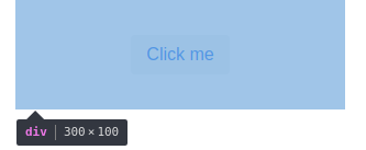
Now that you understand the concepts, let us list some examples. The first example is a classical example of doing a perfect centering of a component inside of its parent. It was impossible to do with CSS prior the flexbox, yet with flexbox it’s just a simple case of setting the proper alignment to the child:
@Route("")
class WelcomeView : VerticalLayout() {
    init {
        flexLayout {
            justifyContentMode = FlexComponent.JustifyContentMode.CENTER
            alignItems = FlexComponent.Alignment.CENTER
            width = "300px"; height = "100px"

            button("Click me")
        }
    }
}
The result is as follows:
The same can be achieved by using the VerticalLayout, albeit with a different API. Note how we specify the alignment of the content in the content{} block:
@Route("")
class WelcomeView : VerticalLayout() {
    init {
        verticalLayout {
            content { align(center, middle) }
            width = "300px"; height = "100px"

            button("Click me")
        }
    }
}
Another case would be a button bar, having a bunch of buttons both on the left side and on the right side. There is a Div acting as an spacer; since it’s expanded it consumes all of the available space, pushing follow-up buttons to the right:
@Route("")
class WelcomeView: VerticalLayout() {
    init {
        flexLayout {
            width = "300px"
            icon(VaadinIcon.EDIT)
            icon(VaadinIcon.TRASH)
            div { isExpand = true }
            icon(VaadinIcon.AIRPLANE)
        }
    }
}

Info: you can use the Vaadin Icons page to search for available Vaadin icons, or you can simply use IDE’s autocompletion feature for available
VaadinIconsenum constants.
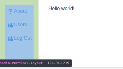
You can use the same approach for building the application frame. We’re going to have the main menu to the right, and expand the left area so that the views can be nested inside of it:
@BodySize(width = "100vw", height = "100vh")
@HtmlImport("frontend://styles.html")
@Viewport("width=device-width, minimum-scale=1.0, initial-scale=1.0, user-scalable=yes")
@Theme(Lumo::class)
class RootLayout : HorizontalLayout(), RouterLayout {
    private val viewContainer: Div
    init {
        setSizeFull()
        verticalLayout {
            width = null; height = "100%"; isSpacing = false; isMargin = false
            button("About", icon = Icon(VaadinIcon.QUESTION)) { themes.add("tertiary") }
            button("Users", icon = Icon(VaadinIcon.USERS)) { themes.add("tertiary") }
            button("Log Out", icon = Icon(VaadinIcon.USERS)) { themes.add("tertiary") }
        }
        viewContainer = div {
            isExpand = true
        }
    }

    override fun showRouterLayoutContent(content: HasElement) {
        viewContainer.removeAll()
        viewContainer.element.appendChild(content.element)
    }
}

/**
 * The main view contains a button and a template element.
 */
@Route("", layout = RootLayout::class)
class WelcomeView : VerticalLayout() {
    init {
        div {
            text("Hello world!")
        }
    }
}
Fields
Another very important set of components are those that handle user input. All of the input components are documented on the Vaadin site, for example on the TextField documentation page.
Every field has a different purpose which we will not document here; for further questions please take a look at the following resources:
- The Vaadin Documentation on Components
- The Vaadin Components List shows all (input) components.
Also please read the Creating Forms article for more information on how to build forms in VoK.
Referencing Components
The textField() function also returns the newly created TextField. This is handy if we want to reference those text fields later, for example from the button click handler:
package com.example.vok

import com.github.vok.karibudsl.flow.*
import com.vaadin.flow.component.notification.Notification
import com.vaadin.flow.component.orderedlayout.VerticalLayout
import com.vaadin.flow.component.textfield.TextField
import com.vaadin.flow.router.Route

@Route("")
class WelcomeView: VerticalLayout() {
    private lateinit var nameField: TextField
    private lateinit var ageField: TextField
    init {
        formLayout {
            nameField = textField("Name:")
            ageField = textField("Age:")
        }
        button("Click me") {
            onClick {
                Notification.show("Hello, ${nameField.value} of age ${ageField.value}")
            }
        }
    }
}
Creating reusable components
The core principle of Vaadin is that it is very easy to create reusable components. For example, in order to create a reusable form, all you need to do is to define a class:
class NameAgeForm : FormLayout() {
    private val nameField = textField("Name:")
    private val ageField = textField("Age:")
    val greeting: String get() = "Hello, ${nameField.value} of age ${ageField.value}"
}
This class is a form layout with two text fields nested inside of it. However, we can’t use it directly in the DSL fashion yet - the integration function is missing:
fun HasComponents.nameAgeForm(block: NameAgeForm.()->Unit = {}): NameAgeForm = init(NameAgeForm(), block)
The function instantiates the form and calls the init() method which will add the newly created form into the parent layout and then it will call the configuration block on it. Now we can rewrite the WelcomeView as follows:
package com.example.vok

import com.github.vok.karibudsl.flow.*
import com.vaadin.flow.component.HasComponents
import com.vaadin.flow.component.formlayout.FormLayout
import com.vaadin.flow.component.notification.Notification
import com.vaadin.flow.component.orderedlayout.VerticalLayout
import com.vaadin.flow.router.Route

@Route("")
class WelcomeView: VerticalLayout() {
    init {
        val form = nameAgeForm()
        button("Click me") {
            onClick {
                Notification.show(form.greeting)
            }
        }
    }
}

class NameAgeForm : FormLayout() {
    private val nameField = textField("Name:")
    private val ageField = textField("Age:")
    val greeting: String get() = "Hello, ${nameField.value} of age ${ageField.value}"
}
fun HasComponents.nameAgeForm(block: NameAgeForm.()->Unit = {}): NameAgeForm = init(NameAgeForm(), block)
The KComposite Pattern
The advantage of extending from KComposite, instead of extending the layout (e.g. VerticalLayout) directly, is as follows:
- The component public API is not polluted by methods coming from the
VerticalLayout, resulting in a more compact and to-the-point API. The API coming fromKCompositeis tiny in comparison. - Since the
VerticalLayoutAPI doesn’t leak into our component, we are free to replace theVerticalLayoutwith any other layout in the future, without breaking the API. - The UI structure is more clearly visible. Take the
ButtonBarclass below as an example: it can clearly be seen that the buttons are nested in theHorizontalLayout:
Example 1.: ButtonBar extending KComposite with a clear UI hierarchy
class ButtonBar : KComposite() {
    val root = ui {
        horizontalLayout {
            button("ok")
        }
    }
}
Example 2.: ButtonBar extending HorizontalLayout without a clear indication that the button is nested in a horizontal layout:
class ButtonBar : HorizontalLayout() {
    init {
        button("ok")
    }
}
The root variable will be marked by the IDE as unused. This is okay: the side-effect of the ui {} is that it runs the horizontalLayout() function which then attaches the HorizontalLayout to the KComposite itself. However, you may prefer to get rid of this unused root variable and call the ui {} from the init {} Kotlin initializer. The downside is that the UI-creating code will be indented by two tabs instead of one.
More Resources
To learn Vaadin:
- Official Vaadin website
- Vaadin Documentation - we recommend to read the Vaadin Flow documentation.
To learn about Kotlin DSLs:
- DSLs: Explained explains how exactly VoK takes advantage of the DSL Kotlin language feature.
- Type-safe builders